


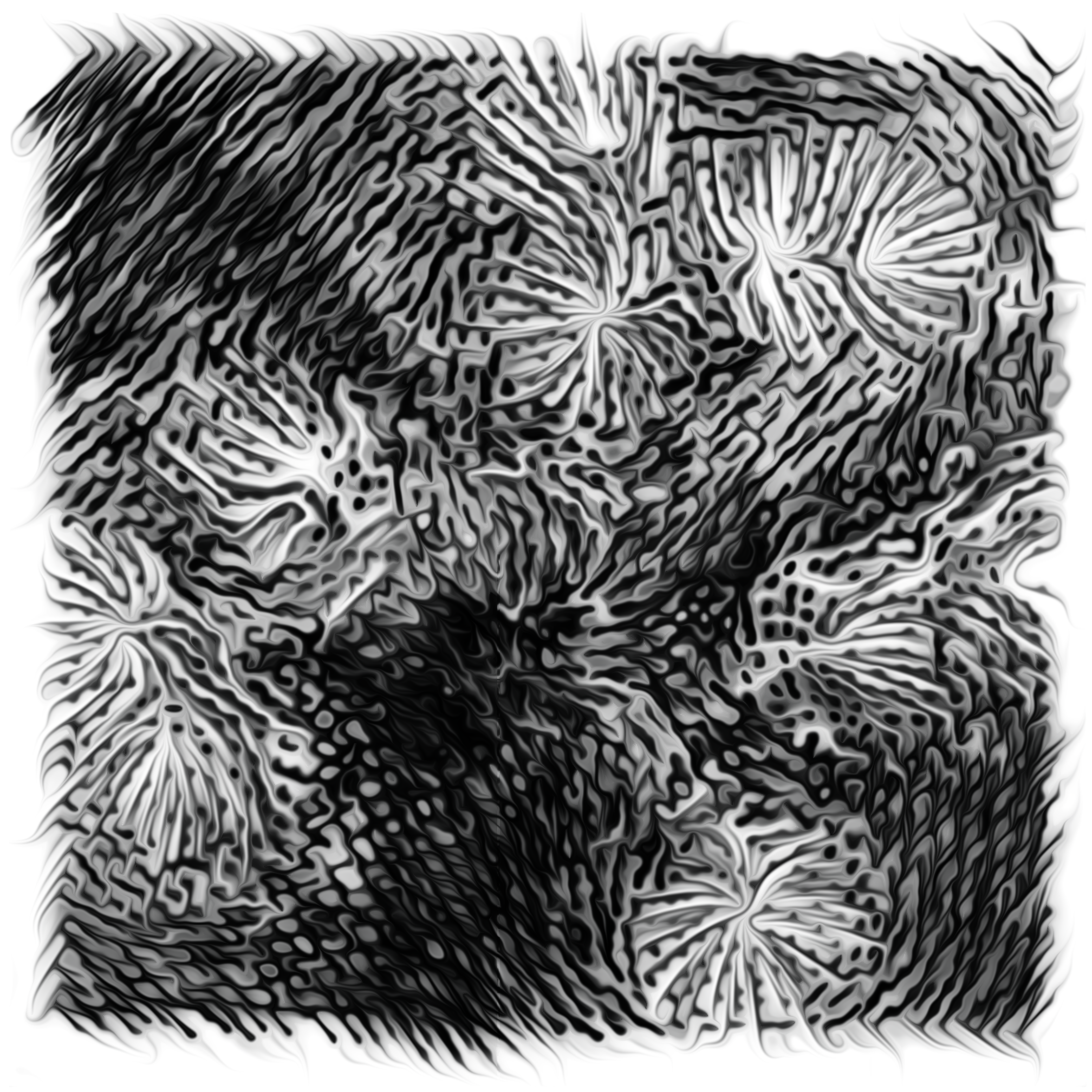

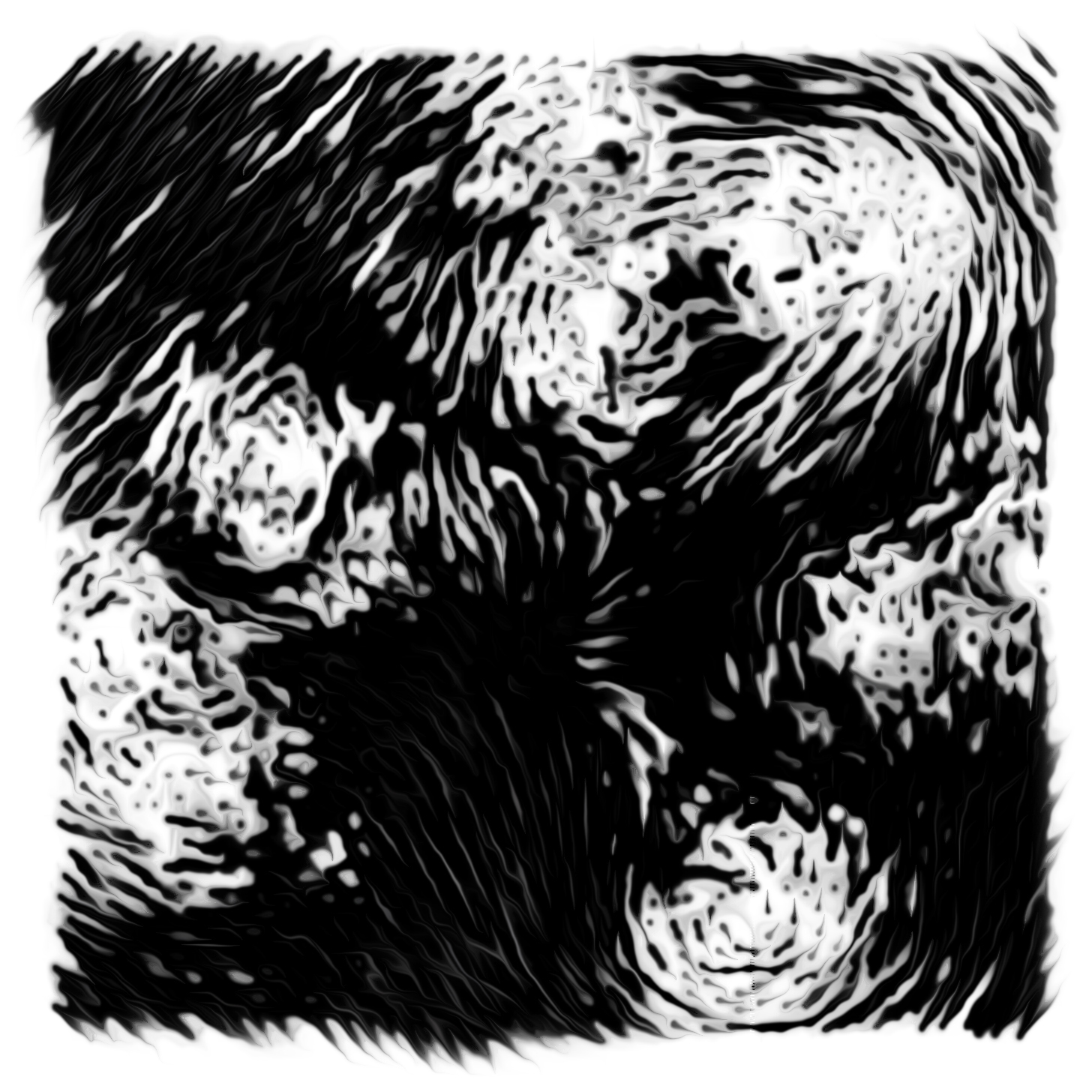


500 Ways of Visualizing a Forest (2017)
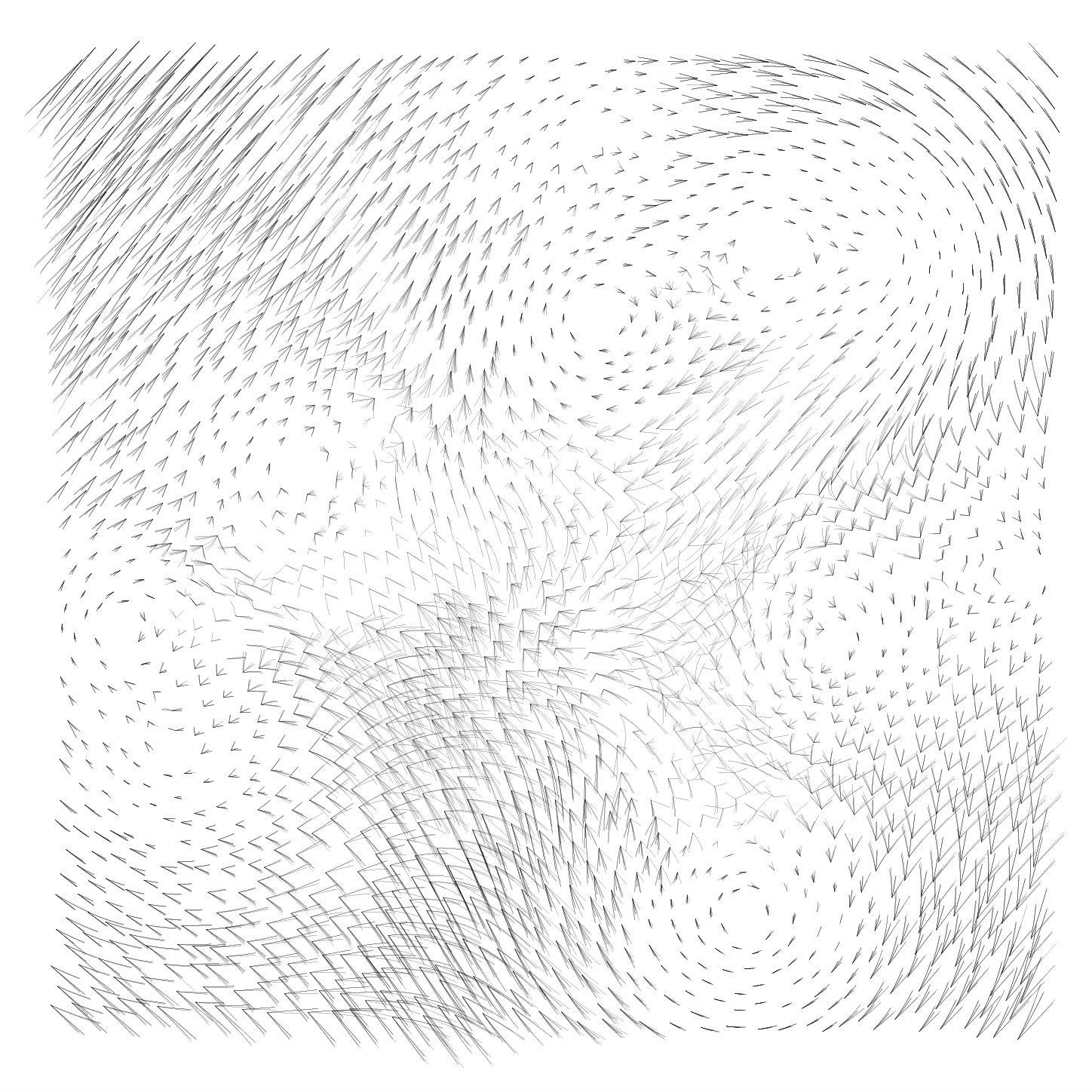
A project in which I begin to consider how a visualization of a forest would look if we were actually able to visualize, map out and comprehend such a complex system. An original data visualization was produced of a 1x1 mile patch of rainforest using data on deforestation from NASA and Google’s Global Forest Watch database. The result is a vector field showing the changes in forest density over time.
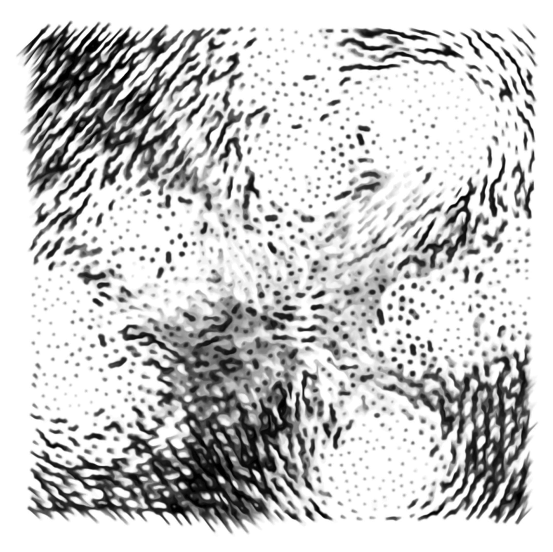
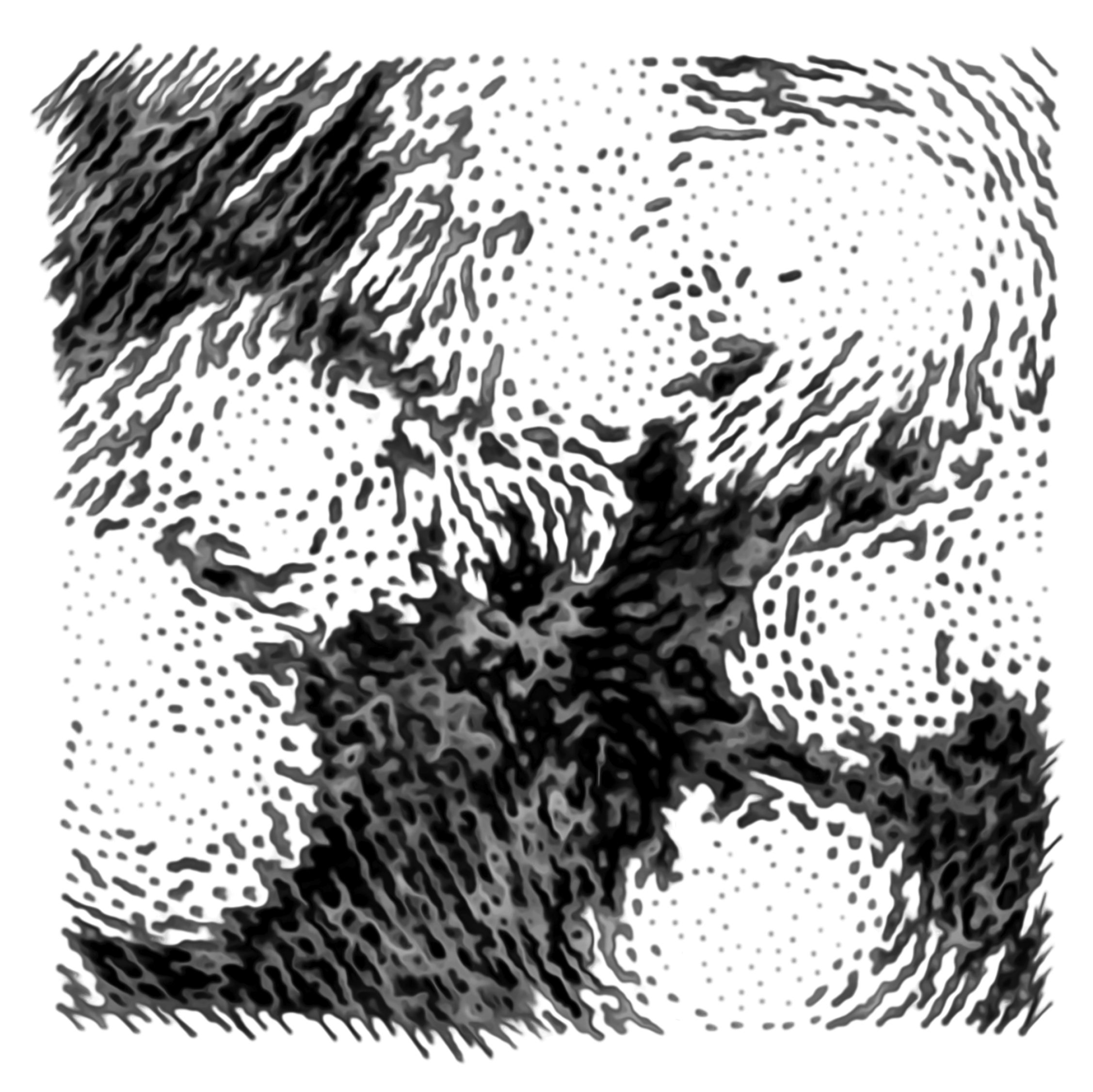
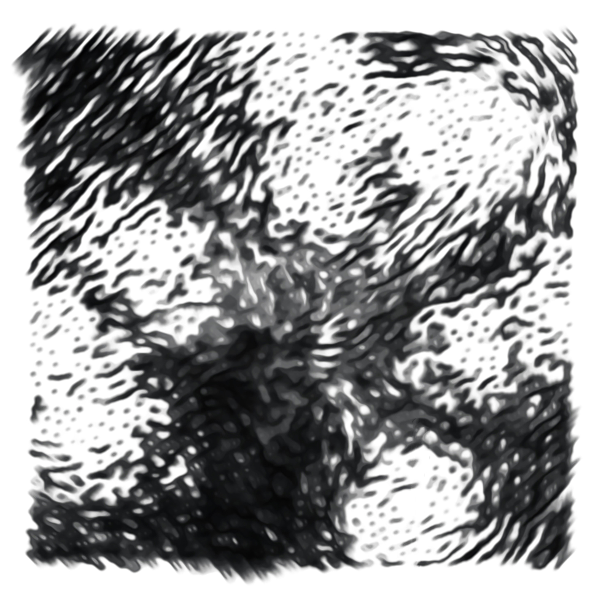
Using a range of different digital softwares, I then proceeded to visualize this same set of data in 500 different ways. Using preset filtering options to change line weights, contrast, noise, blur etc. in order to slowly push the visualization into different directions and at the same time alluding to techniques often used in Machine Vision and the training of AI’s on manipulated data sets (in order to allow computers and algorithms to better understand and read the original data set).
The 500 resulting visualizations are compiled in an artist book, that becomes testament to technology’s boundaries, the limitations of our understanding of complex systems and the innate human desire to decipher the functioning of the natural world around us.